Visual Brand Identity for Visual Branding and Identity Systems (2023).
For this task, I decided to develop the brand for a graphic design studio 'Orbit Studio's' which specialises in digital design.
Software used: Illustrator & InDesign


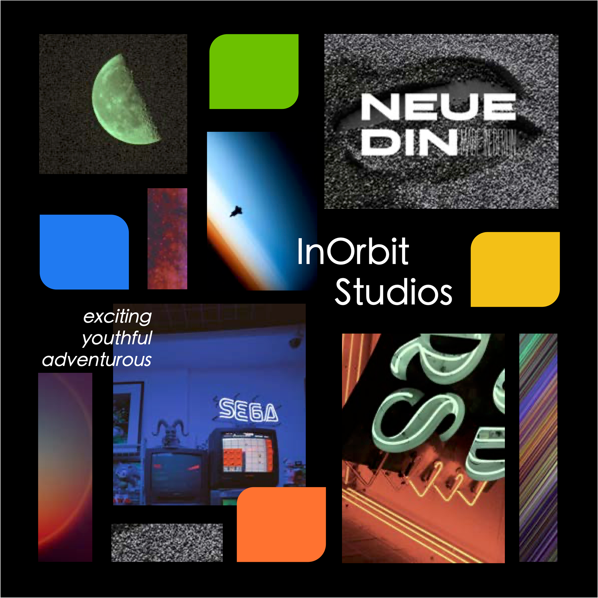
Theme and Mood Board
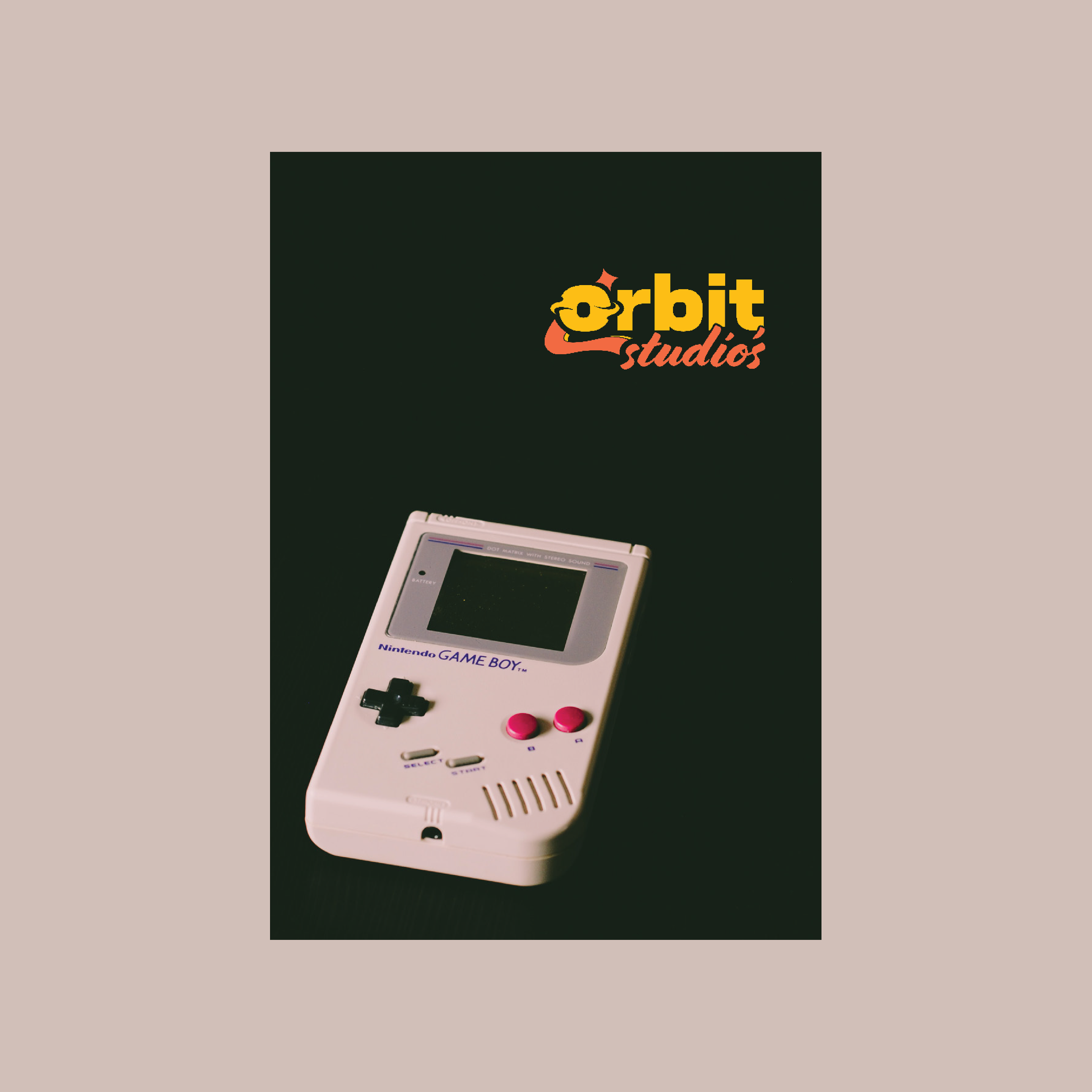
The theme I decided to centre my brand around is retro space. In my mood boards I wanted to capture a bold visual where bright solid colours contrast against dark backdrops. Vintage technology, arcade and grainy images all fit within this theme and conveyed the energy I was going for. My initial idea was to name the brand InOrbit Studios.
Rationale
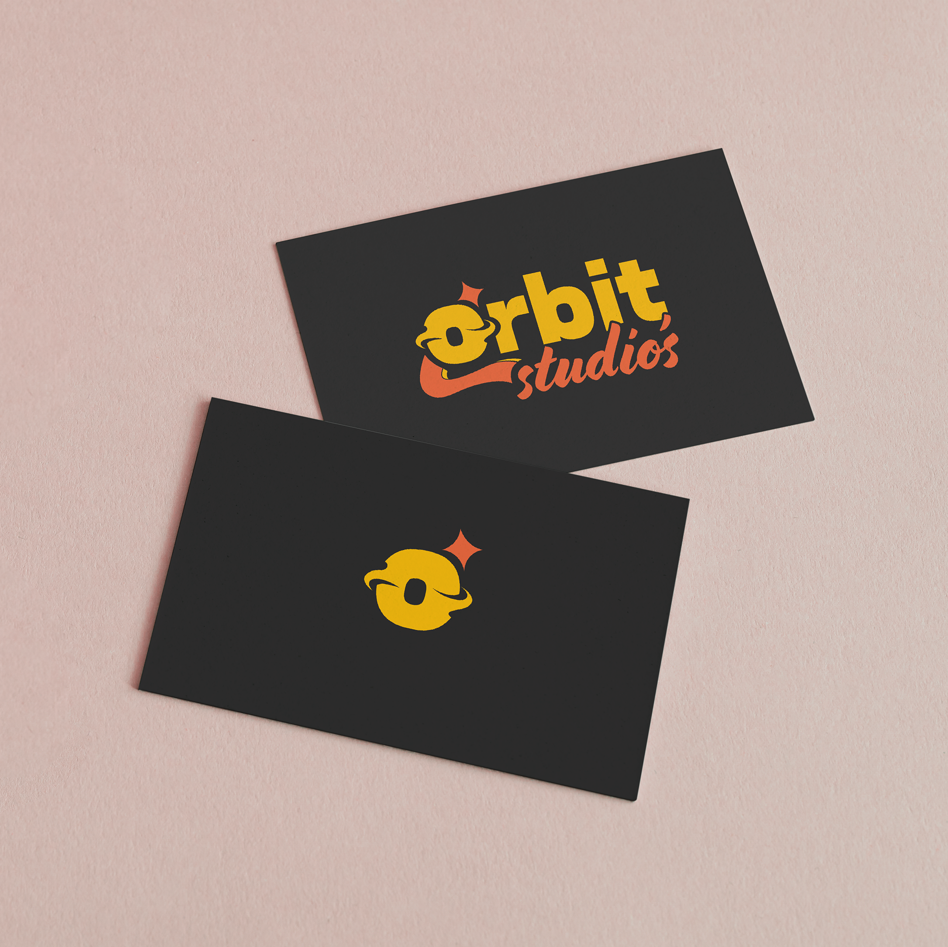
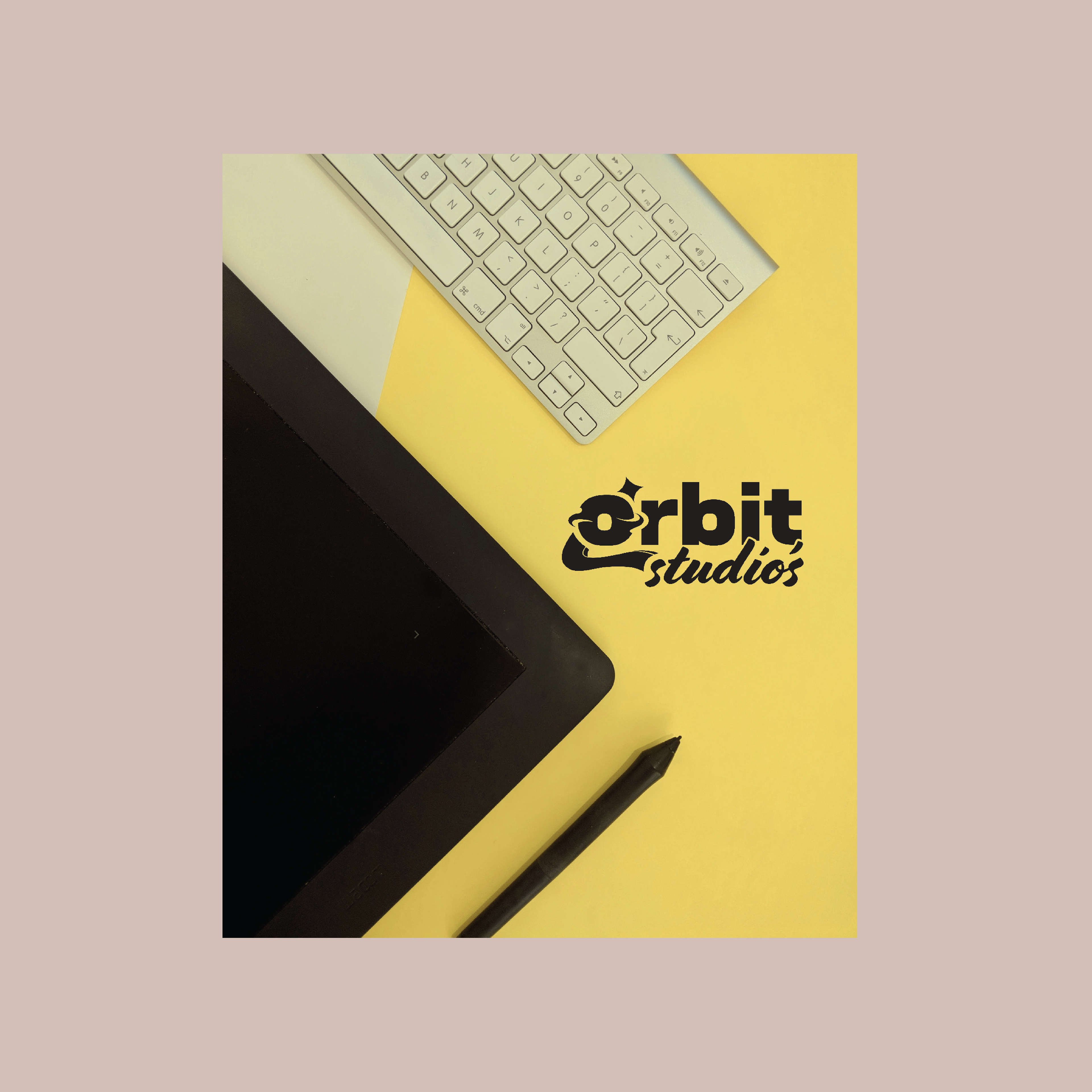
For this task I created the visual brand identity for Orbit Studio’s, which is a graphic design firm that specialises in digital design.
The brand can be described as exciting, youthful and adventurous. The brand’s theme is retro space, so its visual aspects are to evoke nostalgia, creativity and freedom. The logo employs the geometric san-serif typeface Neue DIN capturing the retro feel of both classic and modern. To contrast its compact, geometric and sharp approach, the cursive Cortado Script typeface is used, providing a smooth flow and capturing the artistic purpose of the brand while maintaining readability.
The brand can be described as exciting, youthful and adventurous. The brand’s theme is retro space, so its visual aspects are to evoke nostalgia, creativity and freedom. The logo employs the geometric san-serif typeface Neue DIN capturing the retro feel of both classic and modern. To contrast its compact, geometric and sharp approach, the cursive Cortado Script typeface is used, providing a smooth flow and capturing the artistic purpose of the brand while maintaining readability.
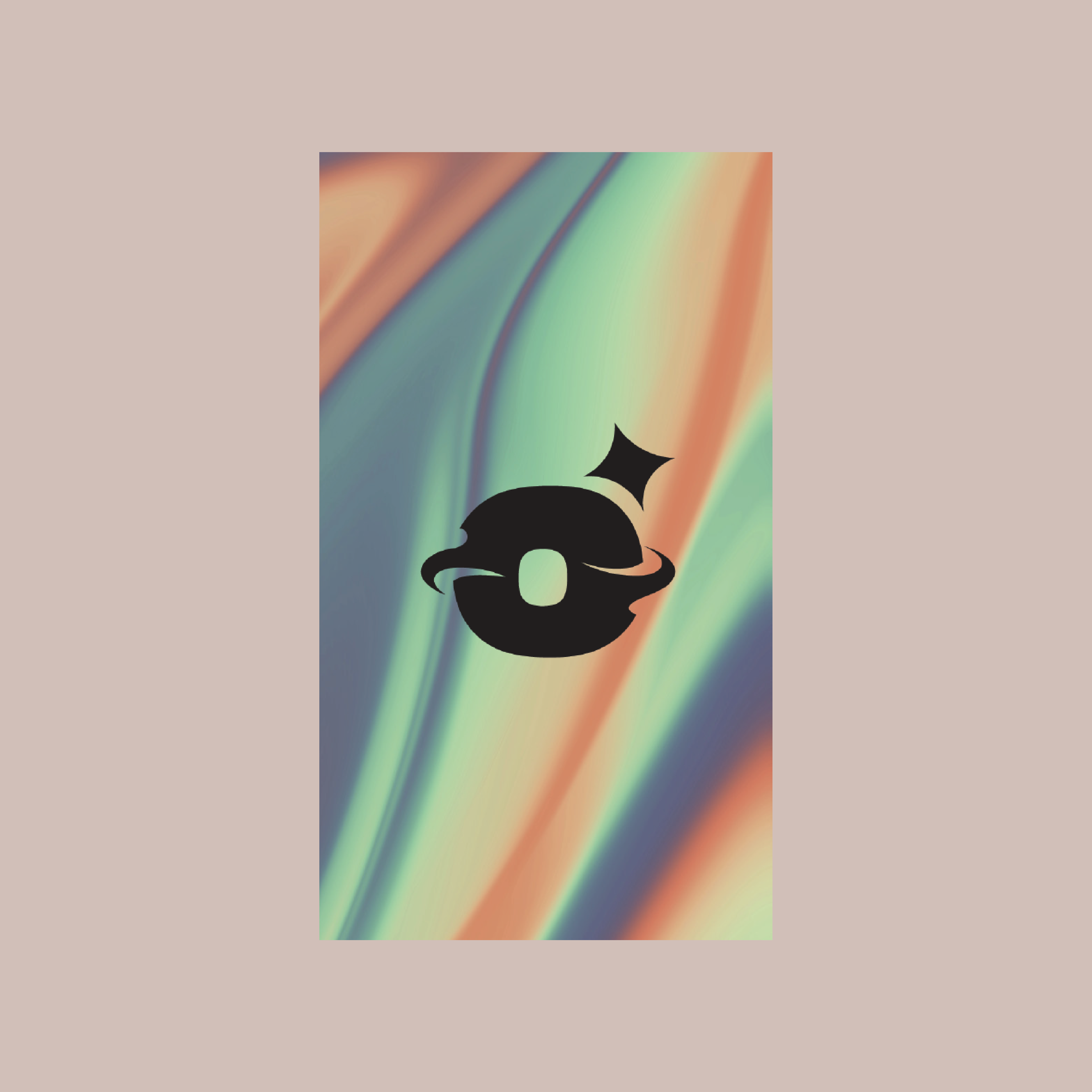
The visual of an orbit is found within the design of the letter ‘O’ which depicts a planet engulfed by flowing rings. Negative space is utilized through the gaps where the orbiting rings overlap with the letter ‘r.’ This feature is maintained throughout the design where overlapping elements seamlessly flow around each other.
Hierarchy is utilised through scale, colour and shape. The word ‘Orbit’ is large, weighted and in bright yellow, instantly capturing the viewer’s attention. While ‘studio’ is smaller in size, the intensity and contrast of the salmon orange with the yellow makes it hard to miss. Furthermore, the flowing shape of the shooting star-like tail assists in guiding the viewer’s eyes onto the secondary word. Moreover, the tail graphic aids in balancing all elements of the logo as otherwise, the top part of the logo would overpower the bottom part. The star’s placement around the O adds to the celestial atmosphere created, where the ’O’ planet is accompanied by the figure of a star much like Earth is accompanied by the sun.
Symmetry is utilised throughout the full logo where elements perfectly align with each other, such as where the point of the shooting star aligns with the edge of the letter ‘r.’ Similarly, the holes in the letters ‘O’ and ‘b’ are perfectly aligned in position and size.
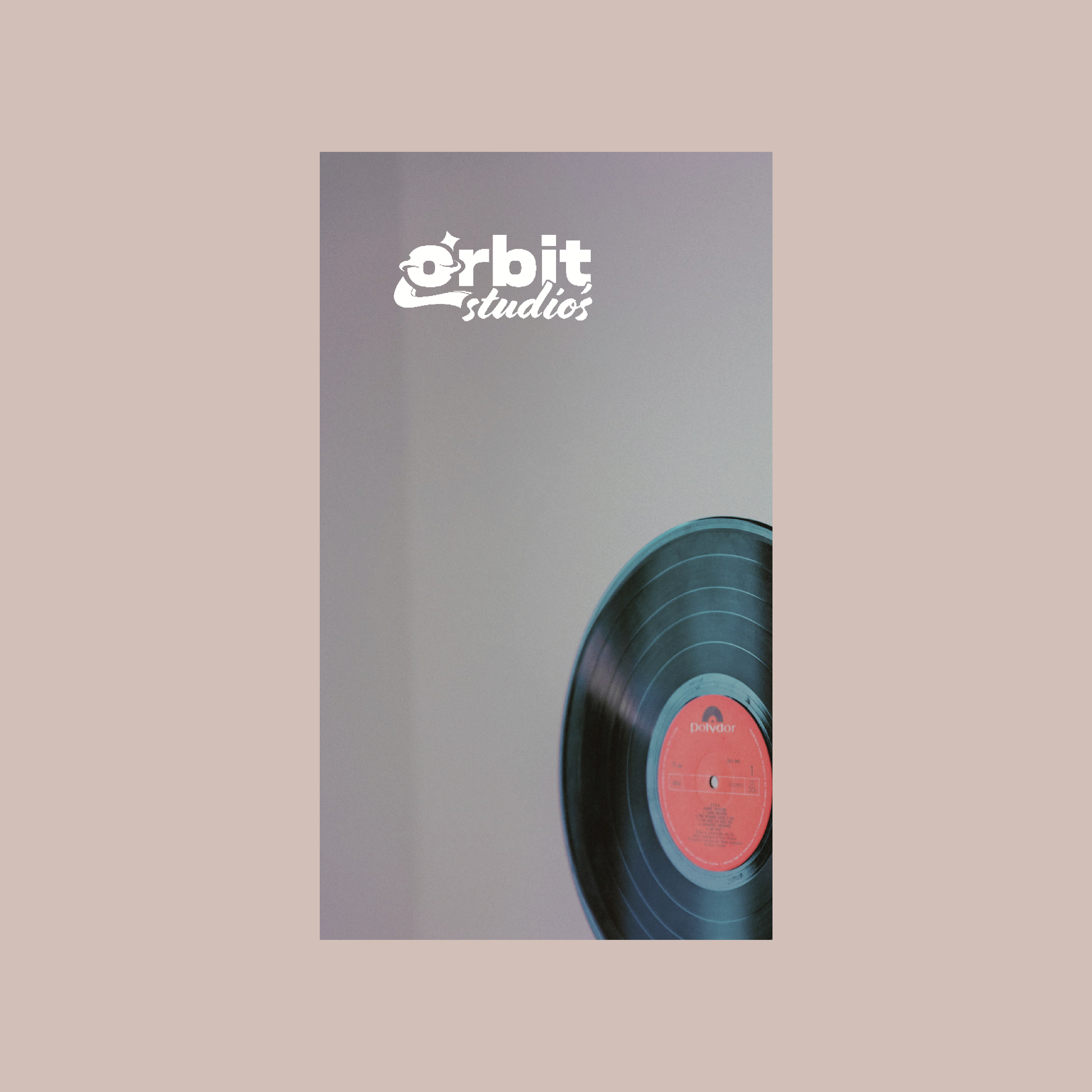
The dark greys in the colour palette are background colours chosen to best accentuate the logo’s bright colours. The faded shades create for a slick and professional design as well as contribute to the retro theme. The graphic for Orbit Studio’s is just the letter O accompanied by the star graphic, providing a simple and compact visual that is highly effective and unique to the brand.
The pattern consists of different iterations of the logo, depicting the design journey, which holds significant connotation to the brand’s work. The ‘space junk’ pattern aims to convey the sense of excitement, freedom as well as the vibrant nature of Orbit Studio’s.