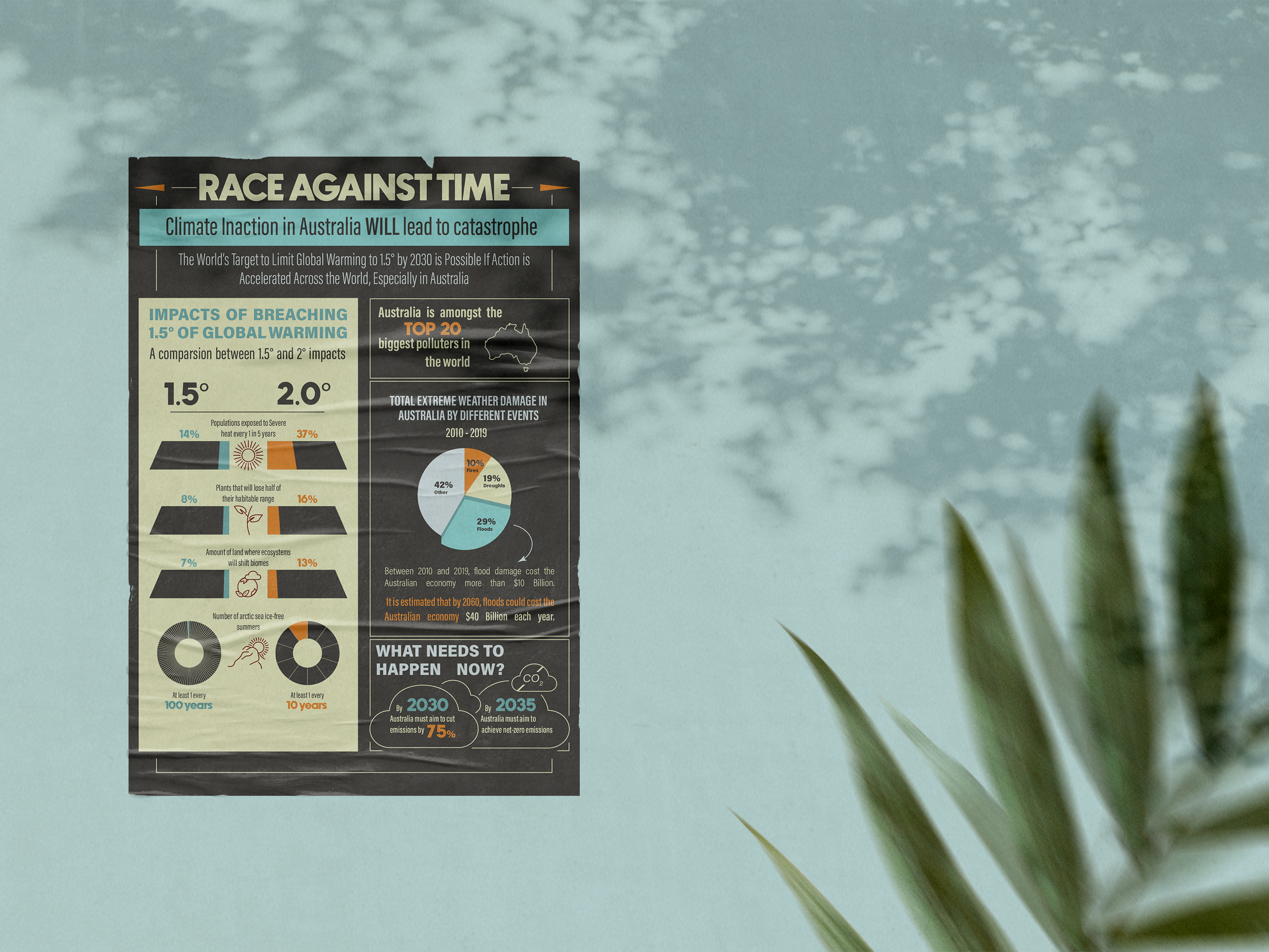
Climate Council Brochure for Visual Communication Theories & Principles (2022).
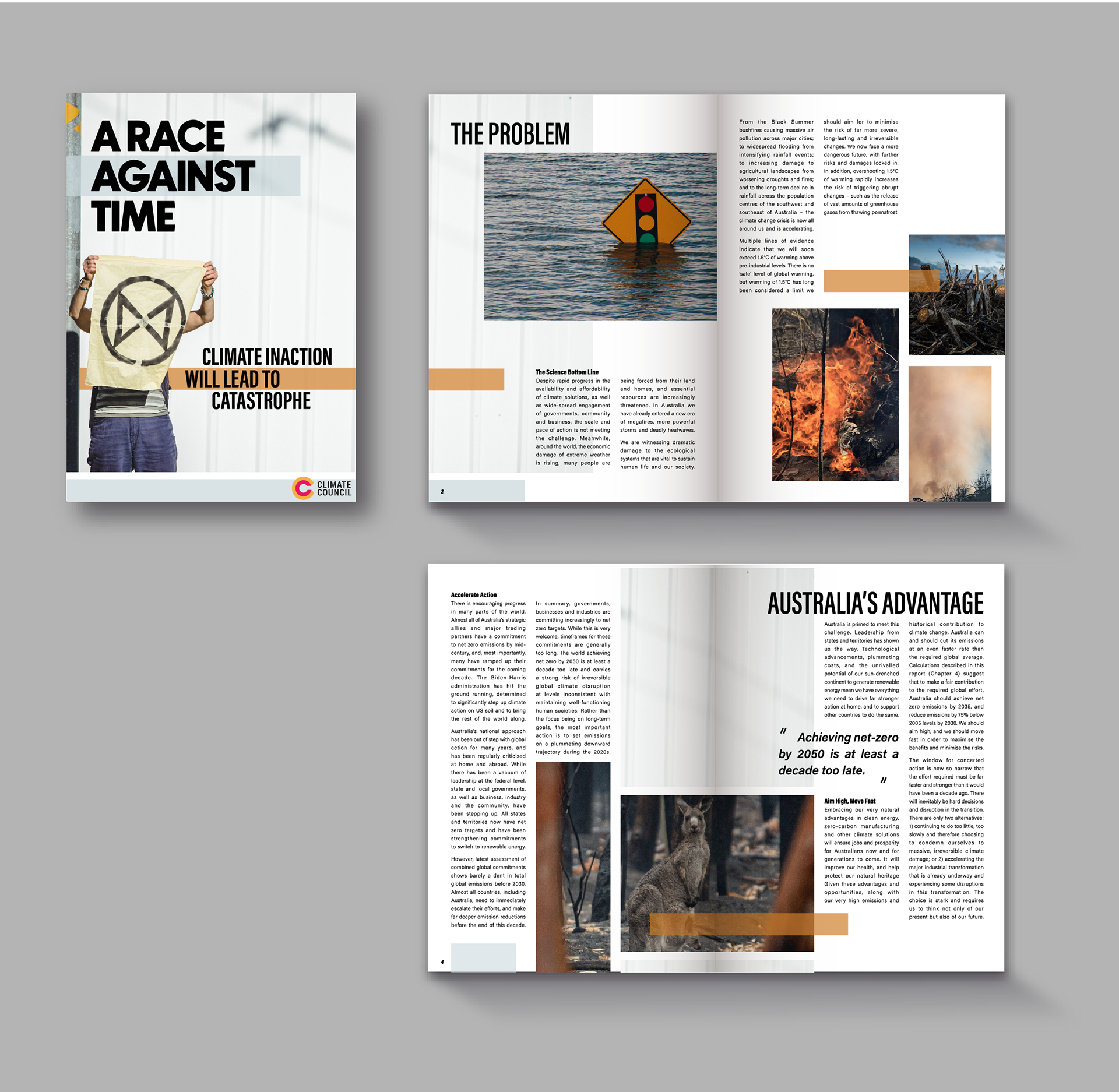
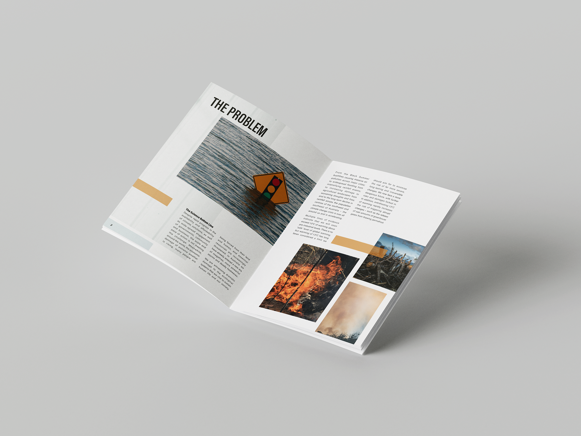
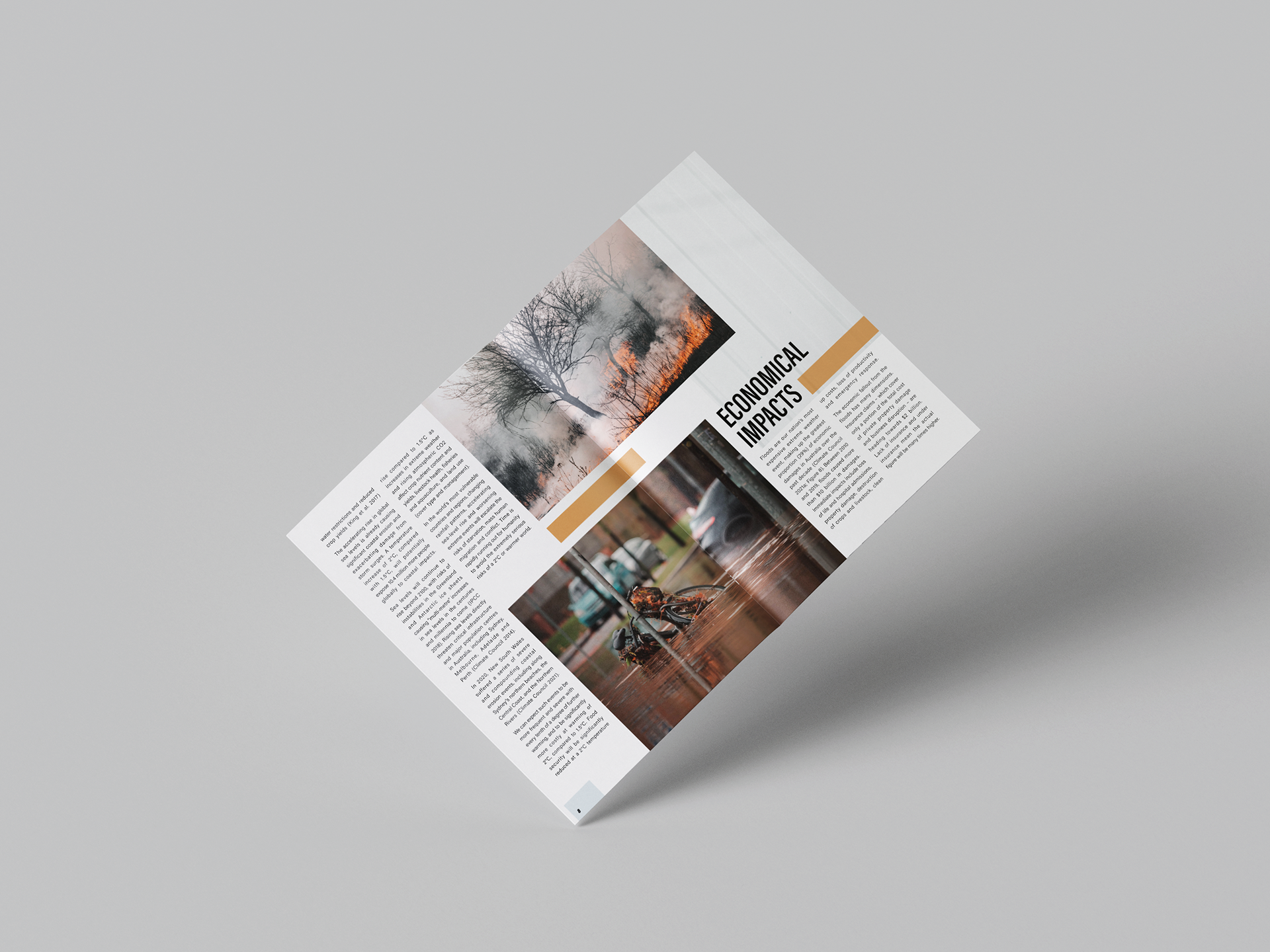
For this task I created an informative 10-page digital brochure that expands on the information presented in my climate council infographic, targeting the same ‘cautious’ demographic in Australia. The brochure matches the info-graphic’s visual language through typography and colour. The brochure’s masthead design creates a direct link to the infographic as it uses the same typeface and title. Similar to the info-graphic’s use of colour, I utilize the contrast between cyan and orange to subtly convey feelings of urgency and hope. This analogous colour scheme is also accentuated through the images used which mostly employ shades of blue and orange.
The brochure differs from the infographic in its use of space; it employs a minimalist, asymmetrical layout to balance out the extensive information. The light background boosts the clarity of the document and enhances the viewer’s experience. As with the infographic, the brochure educates the viewer of the issue gradually, starting by identifying the problem, the consequences and ending with message of hope and call to action.
Software used: InDesign & Photoshop